
This is my capstone project for the Google Data Analytics Professional Certificate. The case uses Bellabeat, a fictional company that makes health-focused smart products for women, and a public FitBit dataset from Kaggle. I used R to look at activity and sleep patterns, then asked what Bellabeat could reasonably test in its product and marketing.
Bellabeat was founded in 2013 by Urška Sršen and Sando Mur. In the course scenario, Sršen asks the marketing analytics team to study smart-device usage and use the results to guide one of Bellabeat's products.
The course lays out six phases: Ask, Prepare, Process, Analyze, Share, and Act. I used those phases as an outline. The questions were:
- What are the trends in smart device usage?
- How can these trends apply to Bellabeat customers?
- How can these trends influence Bellabeat's marketing strategy?
Phase 1: Ask
Bellabeat's marketing analytics team wanted to know how people use smart devices, whether those patterns could inform its customers, and which findings might matter for marketing. I used those questions to keep the analysis focused.
The people in the scenario have different interests:
- Urška Sršen and Sando Mur need a useful direction for the company.
- The marketing and product teams need evidence they can turn into a test.
- Bellabeat customers are the people the product is meant to serve.
- Investors care about the effect on the company's position and finances.
That is enough scope for this project. I did not try to infer a complete product strategy from one public dataset.
Phase 2: Prepare
Before analyzing anything, I checked what the dataset contains and what it cannot support. The FitBit Fitness Tracker Data contains records from thirty users, including minute-level activity, heart rate, sleep, steps, calories, and intensity data.
The files are CSVs hosted in a GitHub repository. They were collected in 2016 through Amazon Mechanical Turk. Kaggle reports more than 90,000 downloads, and Zenodo acknowledges the dataset, but it still comes from a third party and the sample is small. I treated it as course material, not as a current picture of wearable use.
Phase 3: Process
The processing was straightforward:
- Explore the data.
- Check for and handle missing values and duplicates.
- Transform the data into tables that can be joined and analyzed.
I used R to manipulate the data. The Kaggle download contains four CSV files: daily activity, daily sleep, hourly activity, and hourly calories.
library(tidyverse)
library(lubridate)
library(dplyr)
library(ggplot2)
library(tidyr)
daily_activity <- read_csv("repos/google-data-analytics-capstone/fitabase_data/daily_activity_data.csv")
daily_sleep <- read_csv("repos/google-data-analytics-capstone/fitabase_data/daily_sleep_data.csv")
hourly_activity <- read_csv("repos/google-data-analytics-capstone/fitabase_data/hourly_intensity_data.csv")
hourly_calories <- read_csv("repos/google-data-analytics-capstone/fitabase_data/hourly_calories_data.csv")The daily activity table is in wide format. Each row represents a user and a date, while metrics such as steps, calories, and distance live in separate columns.
head(daily_activity)
head(daily_sleep)
head(hourly_activity)
head(hourly_calories)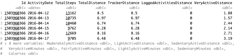
I checked the number of unique user IDs, missing values, and duplicate rows in each file.
num_unique_ids_activity <- length(unique(daily_activity$Id))
num_unique_ids_sleep <- length(unique(daily_sleep$Id))
num_unique_ids_hourly_activity <- length(unique(hourly_activity$Id))
num_unique_ids_hourly_calories <- length(unique(hourly_calories$Id))
The activity tables have 33 IDs. The sleep table has 24 IDs.
missing_values_activity <- sapply(daily_activity, function(x) sum(is.na(x)))
missing_values_sleep <- sapply(daily_sleep, function(x) sum(is.na(x)))
missing_values_hourly_activity <- sapply(hourly_activity, function(x) sum(is.na(x)))
missing_values_hourly_calories <- sapply(hourly_calories, function(x) sum(is.na(x)))
There is no missing data in the source tables.
duplicate_entries_activity <- sum(duplicated(daily_activity))
duplicate_entries_sleep <- sum(duplicated(daily_sleep))
duplicate_entries_hourly_activity <- sum(duplicated(hourly_activity))
duplicate_entries_hourly_calories <- sum(duplicated(hourly_calories))
There are three duplicate rows in daily_sleep. I removed them with:
daily_sleep <- daily_sleep[!duplicated(daily_sleep), ]To merge daily_activity and daily_sleep, I gave both date columns the name ActivityDate and converted them to dates.
daily_activity$ActivityDate <- as.Date(daily_activity$ActivityDate, format = "%m/%d/%Y")

daily_sleep$SleepDay <- as.Date(daily_sleep$SleepDay, format = "%m/%d/%Y %I:%M:%S %p")
names(daily_sleep)[names(daily_sleep) == "SleepDay"] <- "ActivityDate"
I then merged the two tables by user ID and activity date.
merged_df <- merge(daily_activity, daily_sleep, by = c("Id", "ActivityDate"), all.x = TRUE)The merged table became activity_data. I also made sleep_data with only rows that contain the sleep fields needed for the analysis.
activity_data <- merged_df
sleep_data <- na.omit(merged_df[, c("TotalSleepRecords", "TotalMinutesAsleep", "TotalTimeInBed")])
head(merged_df)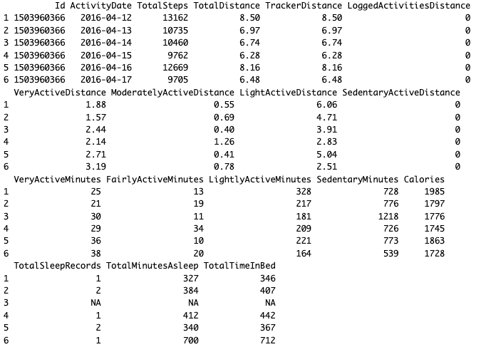
str(merged_df)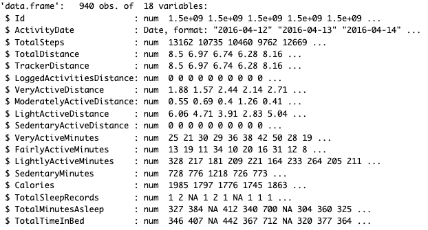
The missing sleep values are expected. The sleep file contains fewer IDs than the activity file, so only users present in both files have sleep values after the join.
The data is now ready for analysis.
Phase 4 and 5: Analyze and Share
I used the cleaned data to answer the three questions above. The analysis uses R, dplyr, ggplot2, and cor() to calculate summaries, draw charts, and check correlations.
I kept the charts that showed a pattern worth discussing and left out variables that did not show an association.
I started with descriptive statistics for daily steps, sleep, time in bed, activity minutes, and calories.
activity_data$TotalSteps %>% summary()
activity_data$VeryActiveMinutes %>% summary()
activity_data$FairlyActiveMinutes %>% summary()
activity_data$LightlyActiveMinutes %>% summary()
sleep_data$TotalMinutesAsleep %>% summary()
sleep_data$TotalTimeInBed %>% summary()
activity_data$Calories %>% summary()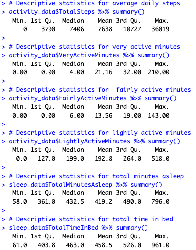
I used histograms to see how total steps and minutes asleep were distributed.
ggplot(activity_data, aes(x = TotalSteps)) +
  geom_histogram(binwidth = 1000, fill = "skyblue", color = "black")

ggplot(sleep_data, aes(x = TotalMinutesAsleep)) +
  geom_histogram(bins = 40, fill = "skyblue", color = "black")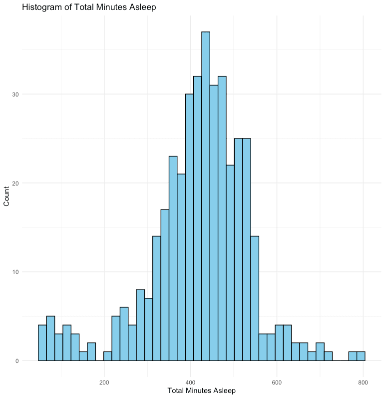
Steps and calories
The scatter plot shows a clear relationship between steps and calories. The correlation is 0.59, which is moderate. That makes sense because walking uses energy, but it still does not make steps a precise calorie estimate.
correlation_steps_calories <- cor(activity_data$TotalSteps, activity_data$Calories, use = "complete.obs")
print(correlation_steps_calories)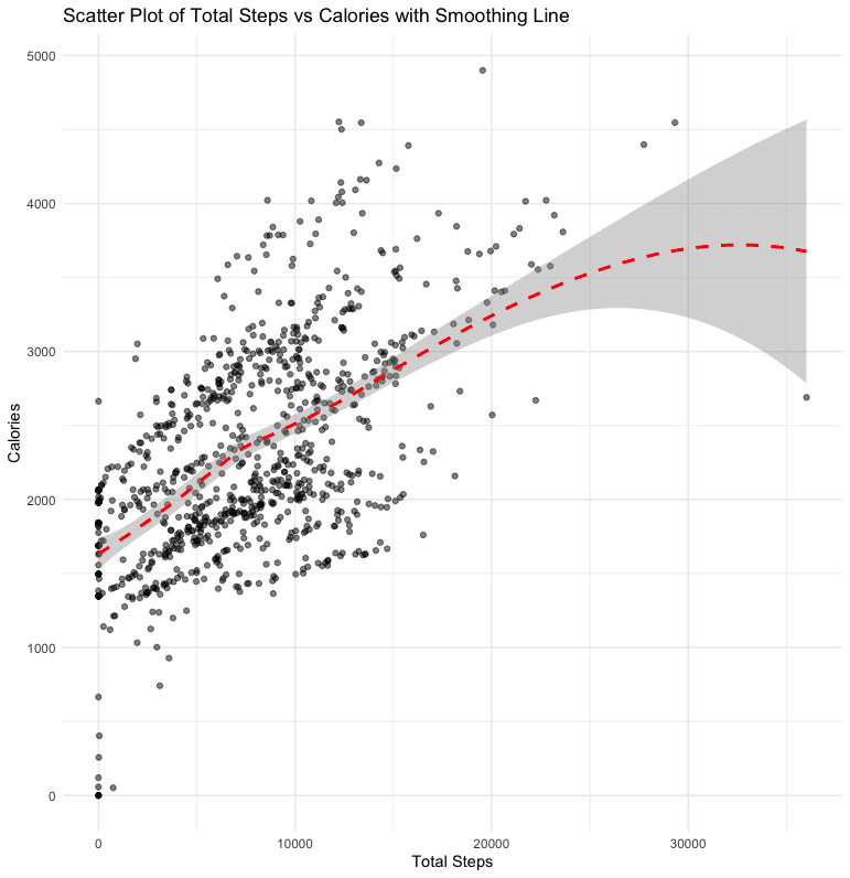
Sedentary minutes and sleep
The relationship between sedentary minutes and sleep is weak and negative. The plot is fairly flat between roughly 500 and 1000 sedentary minutes, then slopes down at higher values. That may reflect a threshold or another factor in the data. It is still only a correlation, so it cannot show that sitting causes less sleep.
correlation_sedentary_sleep <- cor(merged_df$SedentaryMinutes, merged_df$TotalMinutesAsleep, use = "complete.obs")
print(correlation_sedentary_sleep)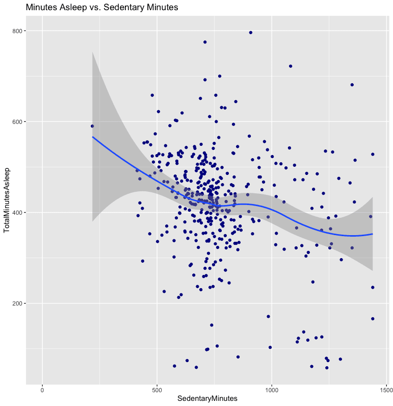
Hourly activity levels
Activity is highest between 5 pm and 7 pm. The dataset cannot explain why. Work schedules, meal times, and evening workouts are all possible explanations.
hourly_activity %>%
  mutate(Hour = hour(ActivityHour)) %>%
  group_by(Hour) %>%
  summarise(mean_total_int = mean(TotalIntensity, na.rm = TRUE))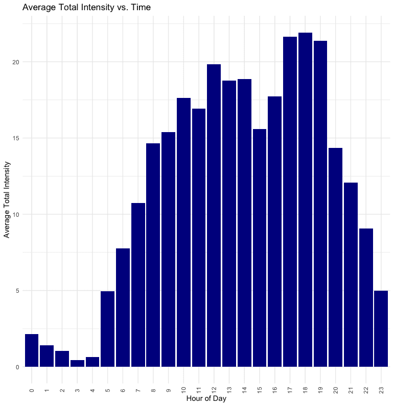
Hourly calorie levels
Calories also peak between 5 pm and 7 pm, matching the intensity chart. The calorie distribution is less variable than the intensity distribution.
hourly_calories %>%
  mutate(Hour = hour(ActivityHour)) %>%
  group_by(Hour) %>%
  summarise(mean_calories = mean(Calories, na.rm = TRUE))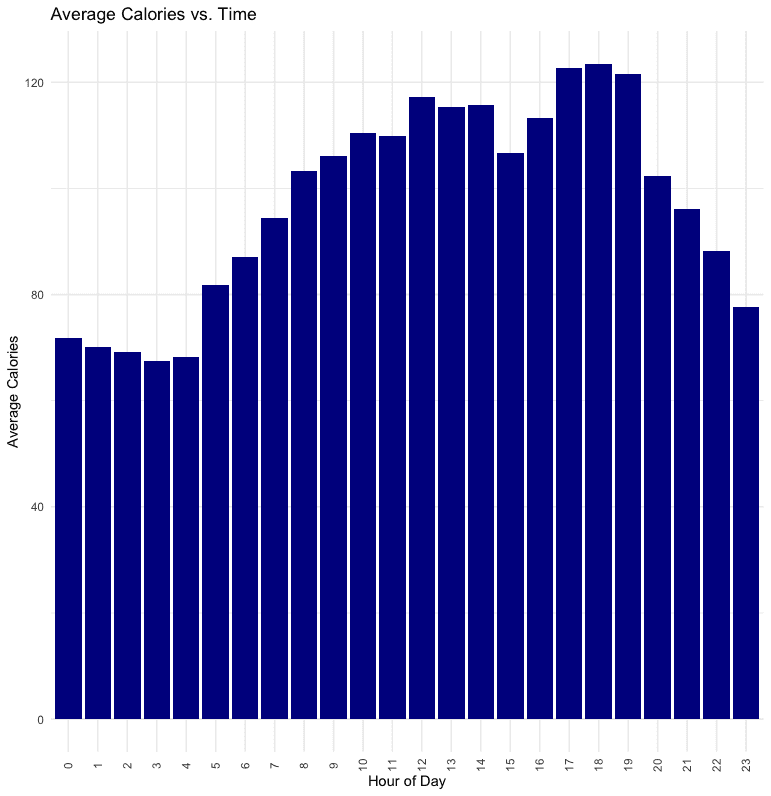
Phase 6: Act
The charts point to a few questions Bellabeat could test. They do not answer them on their own.
- Activity is highest between 5 pm and 7 pm. A reminder or workout suggestion could be tested in the late afternoon.
- Steps and calories have a moderate correlation of 0.59. That could support a simple activity summary, but it is not a precise calorie estimate.
- Sedentary minutes and sleep show a weak relationship. The data is not enough to claim that one causes the other, so any sleep feature would need a better study.
A small, old sample should not decide Bellabeat's product strategy. The next analysis should use newer data from more people, then test one product or messaging idea against a clear outcome.
The recommendation stays narrow. Clean the data, check what the sample can support, and do not ask this chart to carry more weight than it can.